

Cultural Partnership Group B&D
When I was approached by the Cultural Partnership Group (CPG), they needed support in developing a new logo and visual identity, something that would reflect their mission to bring together Barking & Dagenham’s creative community.
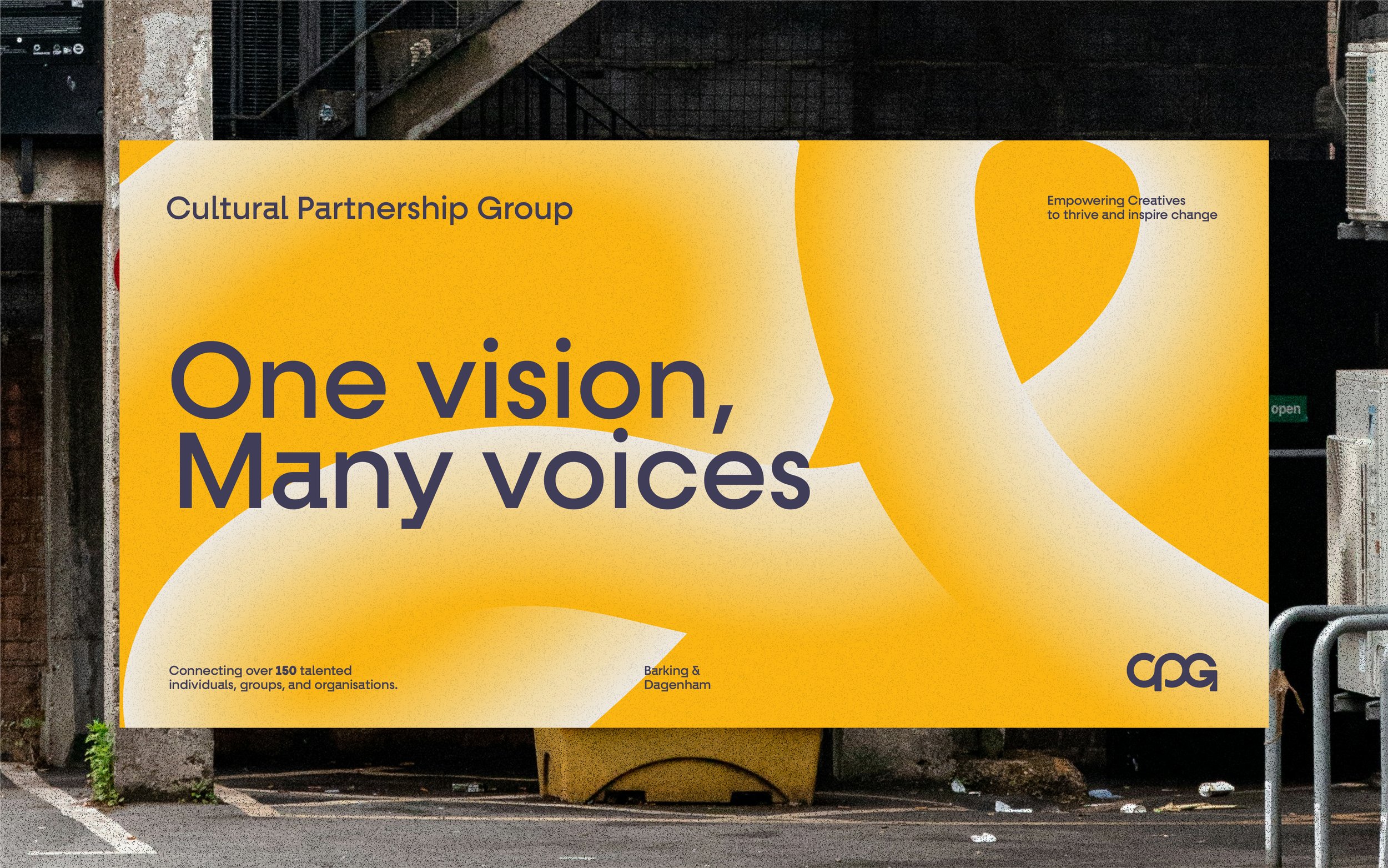
CPG is a creative network, empowering over 150 artists and organisations to collaborate and grow a vibrant, inclusive cultural scene through shared resources, training, and mutual support.
What made this project particularly meaningful for me is that Barking & Dagenham is where I was born and raised. Having the opportunity to contribute to something that champions creativity in the borough where I grew up was genuinely special.
Client
CPG
Field
Brand Design
Year
2025
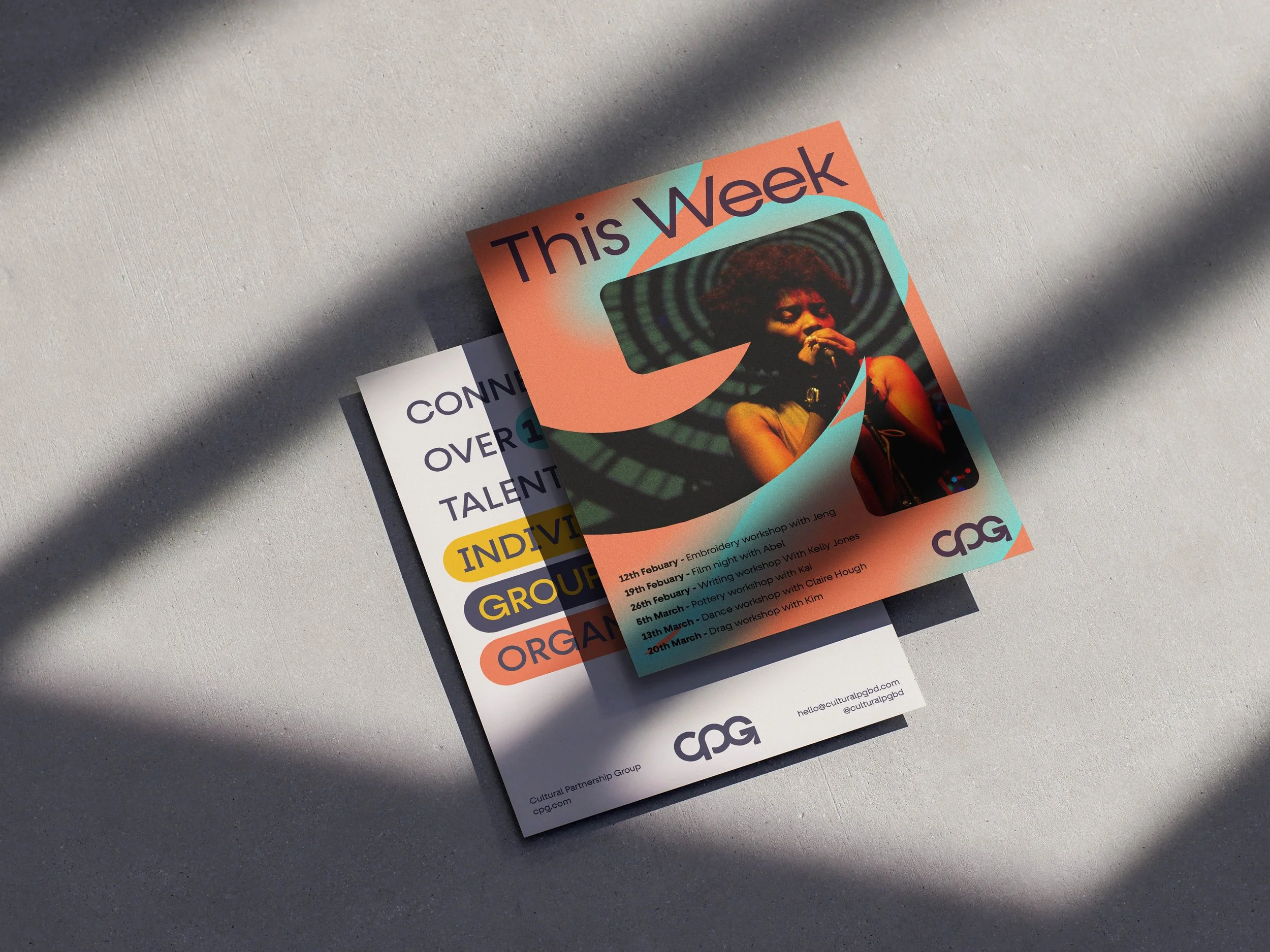
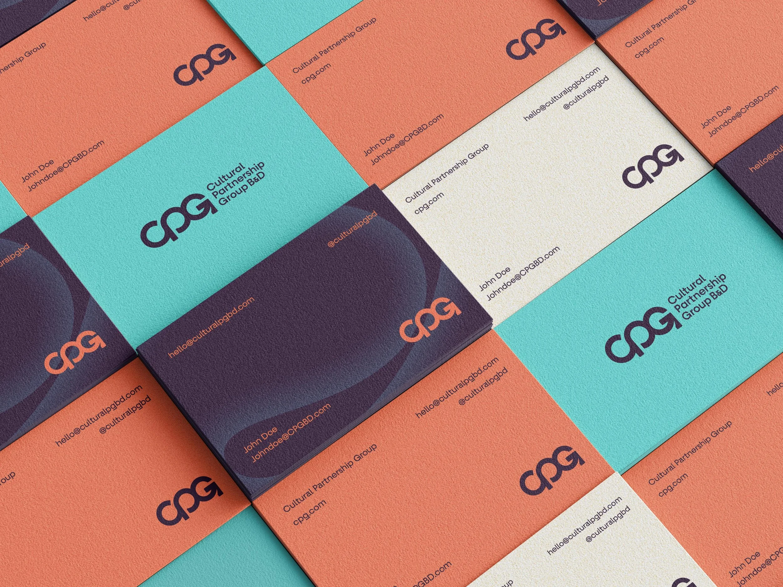
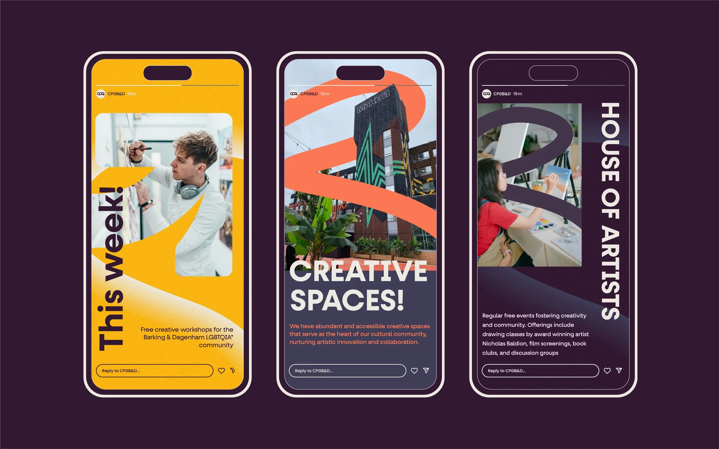
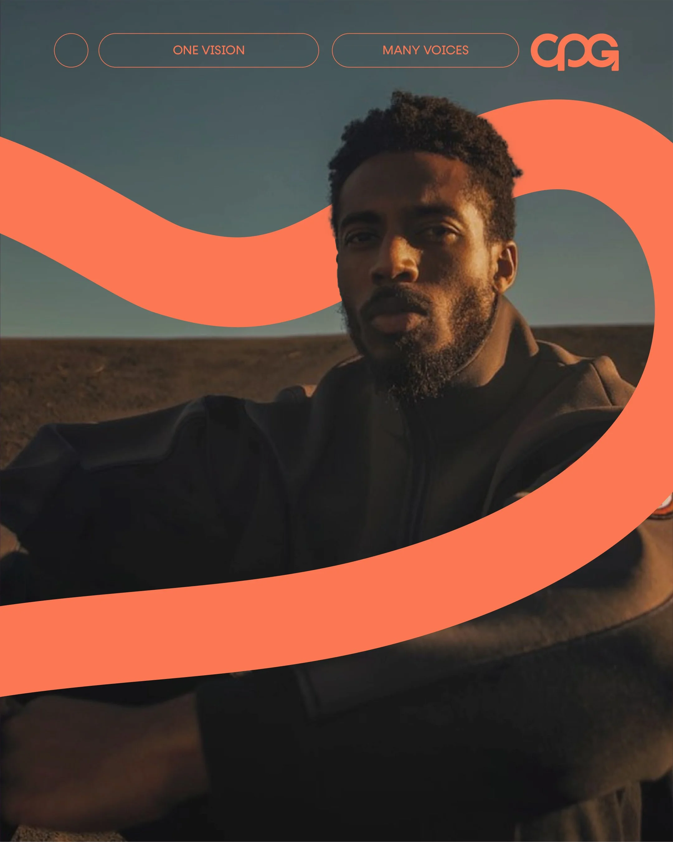
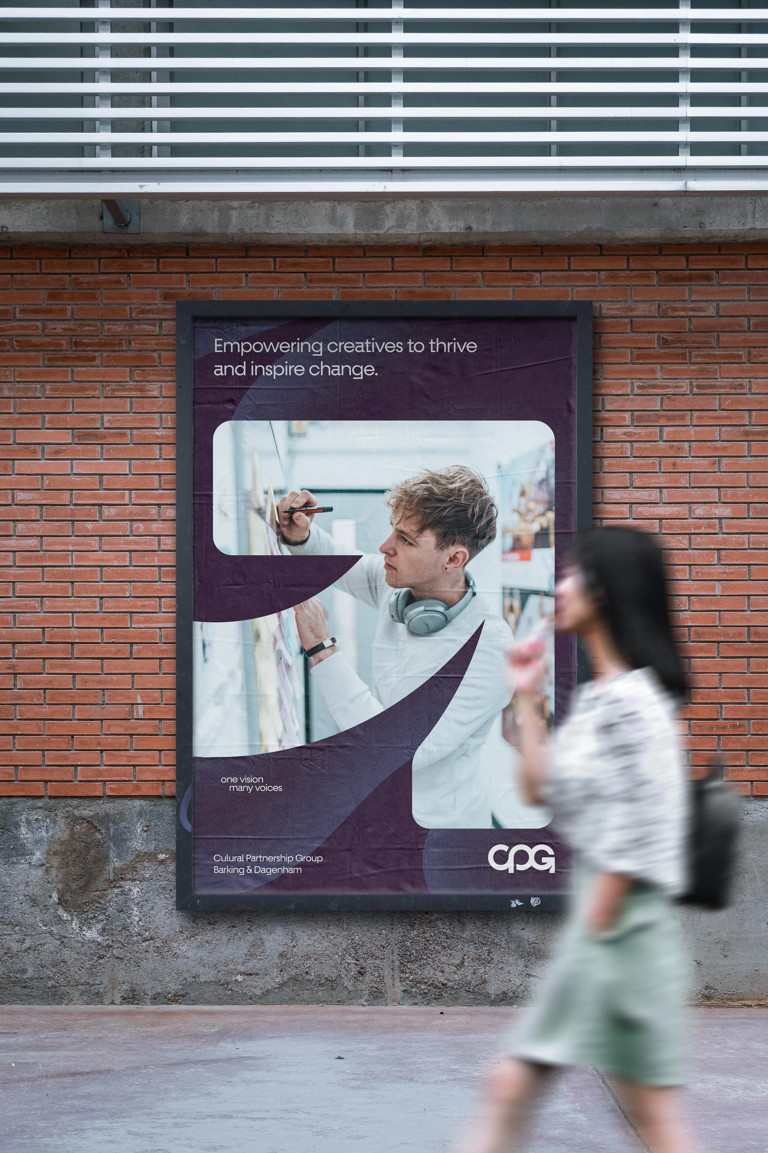
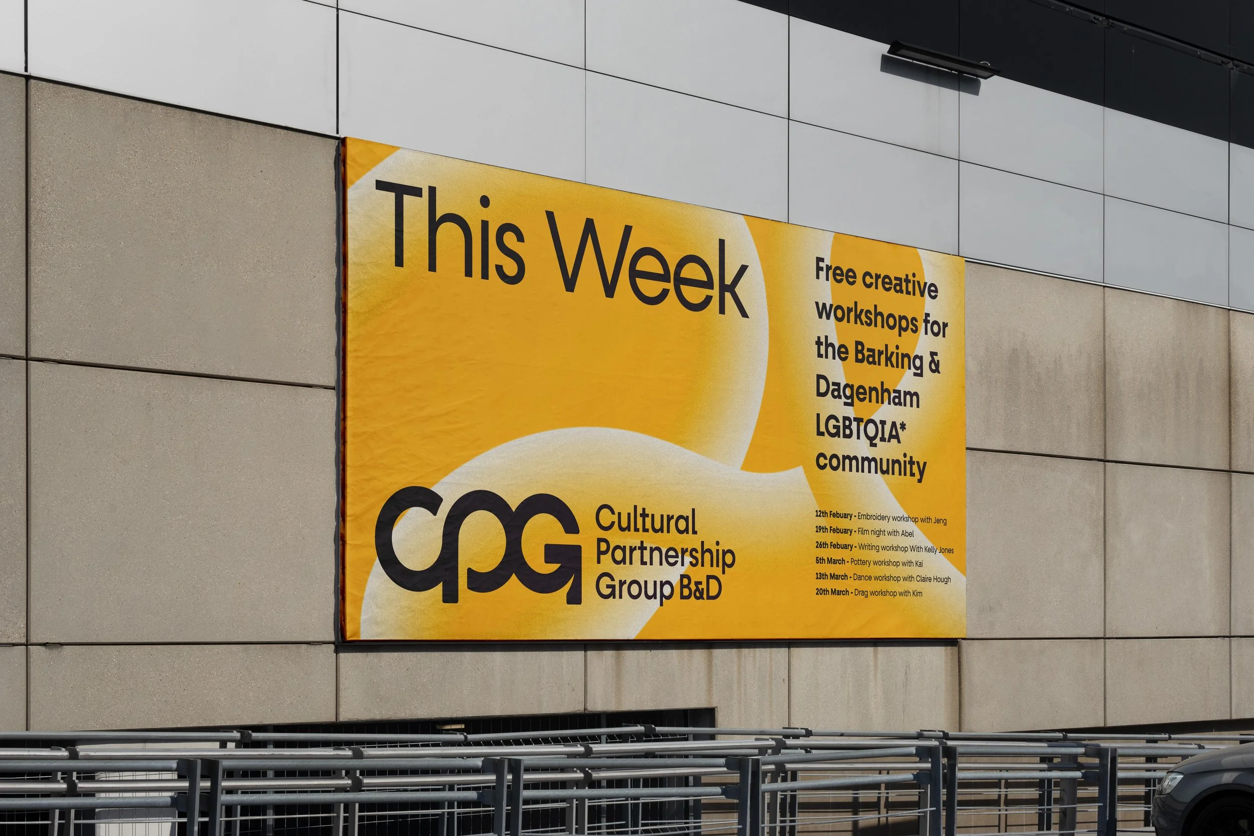
The fluid movement of the mark then lent itself perfectly to the full visual identity. With bold colours and thick stroke patterns across the marketing collateral, the brand’s diversity and disruptive approach were further emphasised. The arrow shape of the G lent itself to a perfect image window showcasing the 150 artists they promote through their organisation.
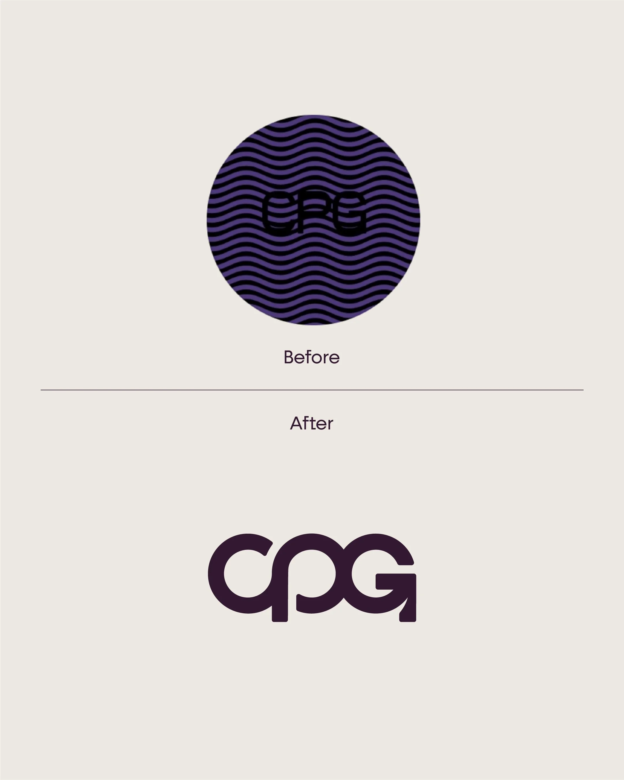
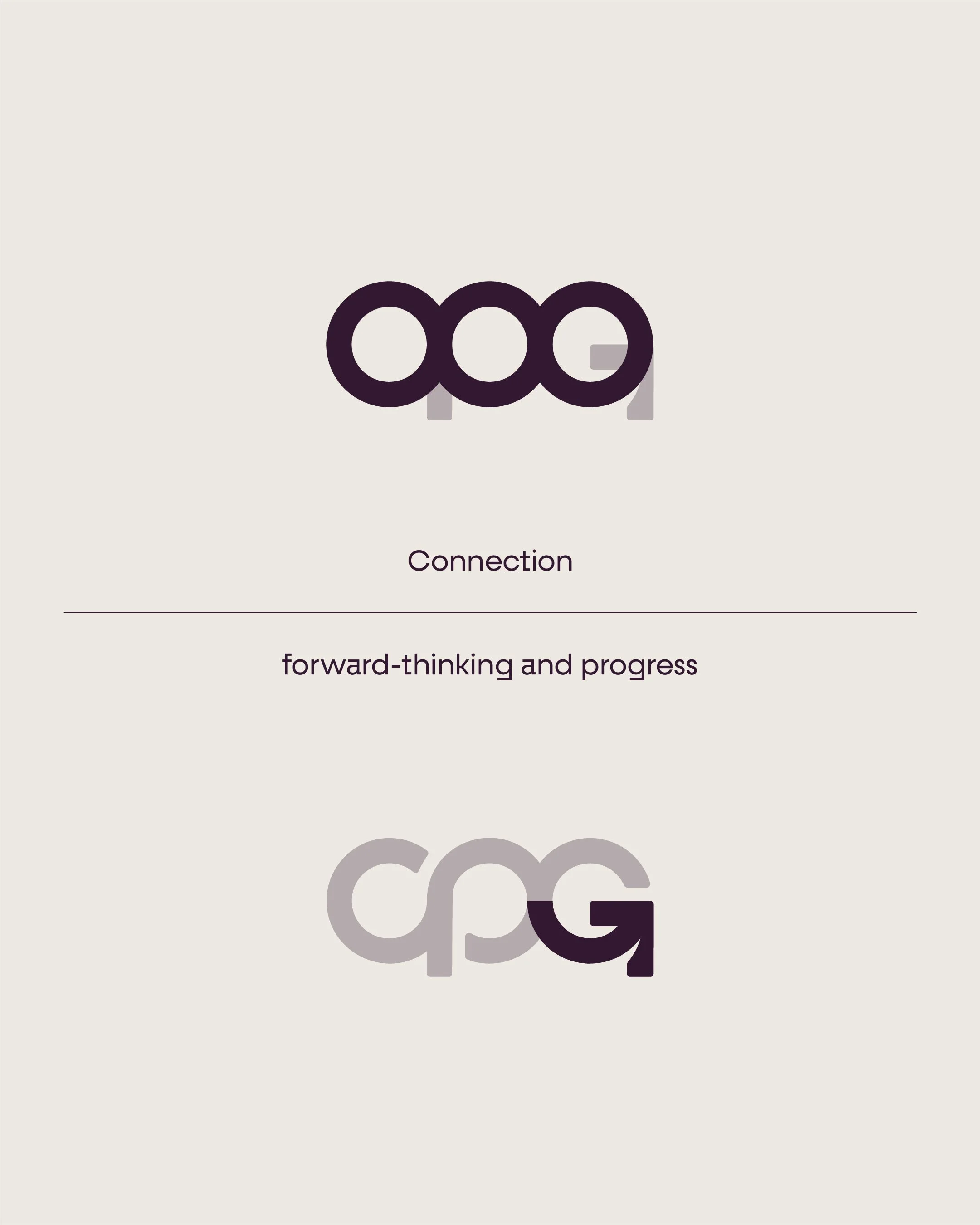
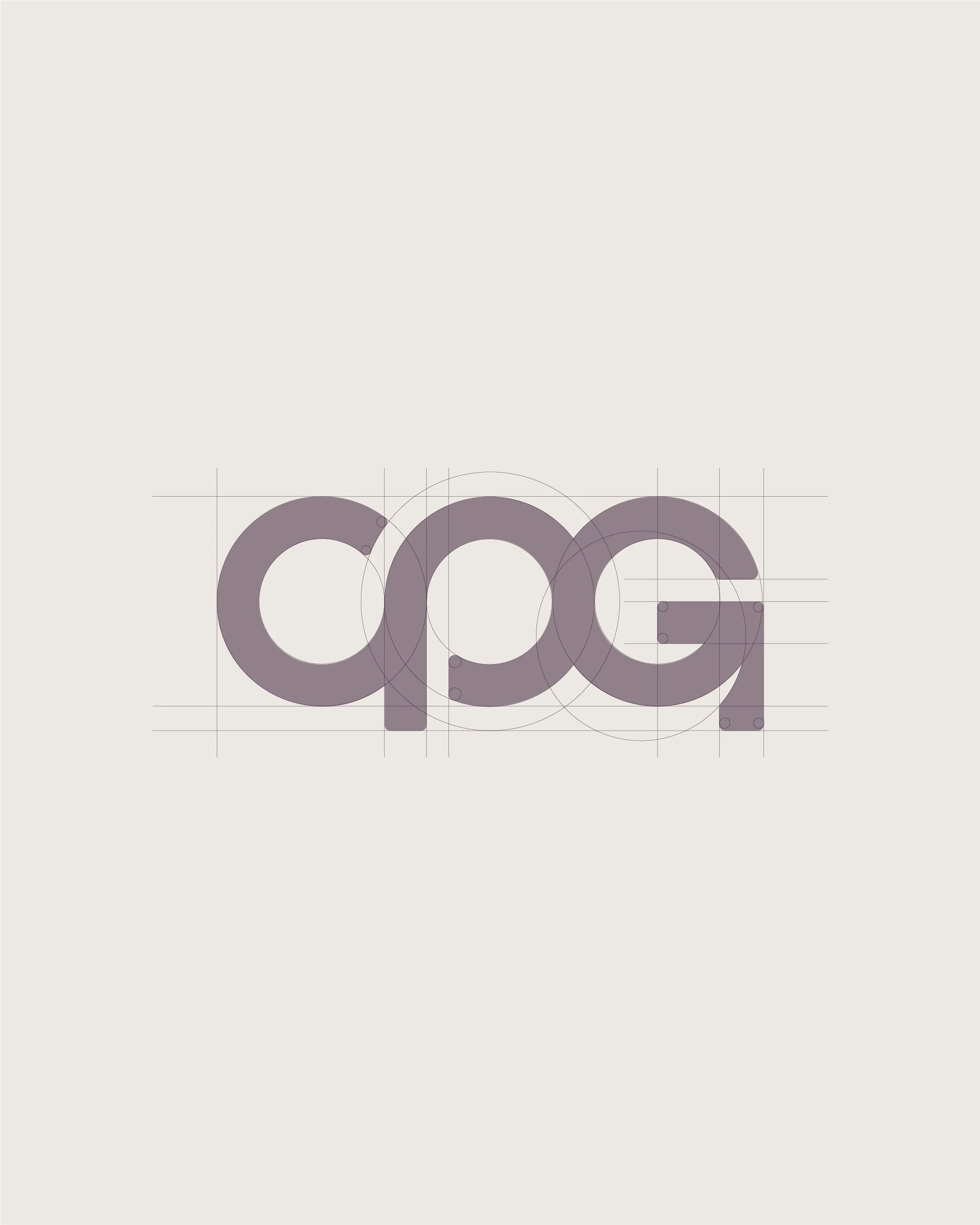
When designing the logo, simplicity was key. After conversations with the team at CPG, we decided the best approach was to create a mark that abbreviates Cultural Partnership Group to accommodate the various instances in which the logo would be presented. Through the brand Noun process I use at the start of every logo project, the primary focus for the subject matter was ‘connection’ and ‘progress’. After experimenting with various fonts, I found the best approach was a custom logo mark combining three circles, interconnecting with a forward arrow to finish off the G, symbolising the brand's forward-thinking, progress-driven ethos.
More than a logo…
Testimonial