


Premium Identity Built for Market Disruption
Sip came to me with a clear objective: a visual identity that communicates exceptional quality, sustainability, and modernity in a category dominated by dated aesthetics. In a crowded shelf‑space, their design needed to justify premium pricing, capture attention instantly, and reflect the brand’s ethical ethos.
Through strategic exploration and custom illustration, we gave Sip a vibrant, modern identity that elevates perception, enhances brand recall, and supports ambitious retail goals.
Client
Sip Syrup
Field
Visual Identity/Illustration
Year
2024/2025

Strategy meets craft
Key elements of our approach:Brand Strategy Integration: Defined the brand personality - playful, sustainable, premium - to guide every design decision.Visual Differentiation: Developed a bold colour palette, distinctive typography, and custom illustrations to stand out on the shelf and online.Flexible Identity System: Created scalable design components for packaging, digital assets, and future product extensions.Consumer-Centric Design: Every element was tested for clarity, legibility, and appeal to the target audience.
We began with a deep dive into Sip’s market positioning and the competitive landscape. The goal was to create a visual identity that not only looked great but strategically elevated the brand.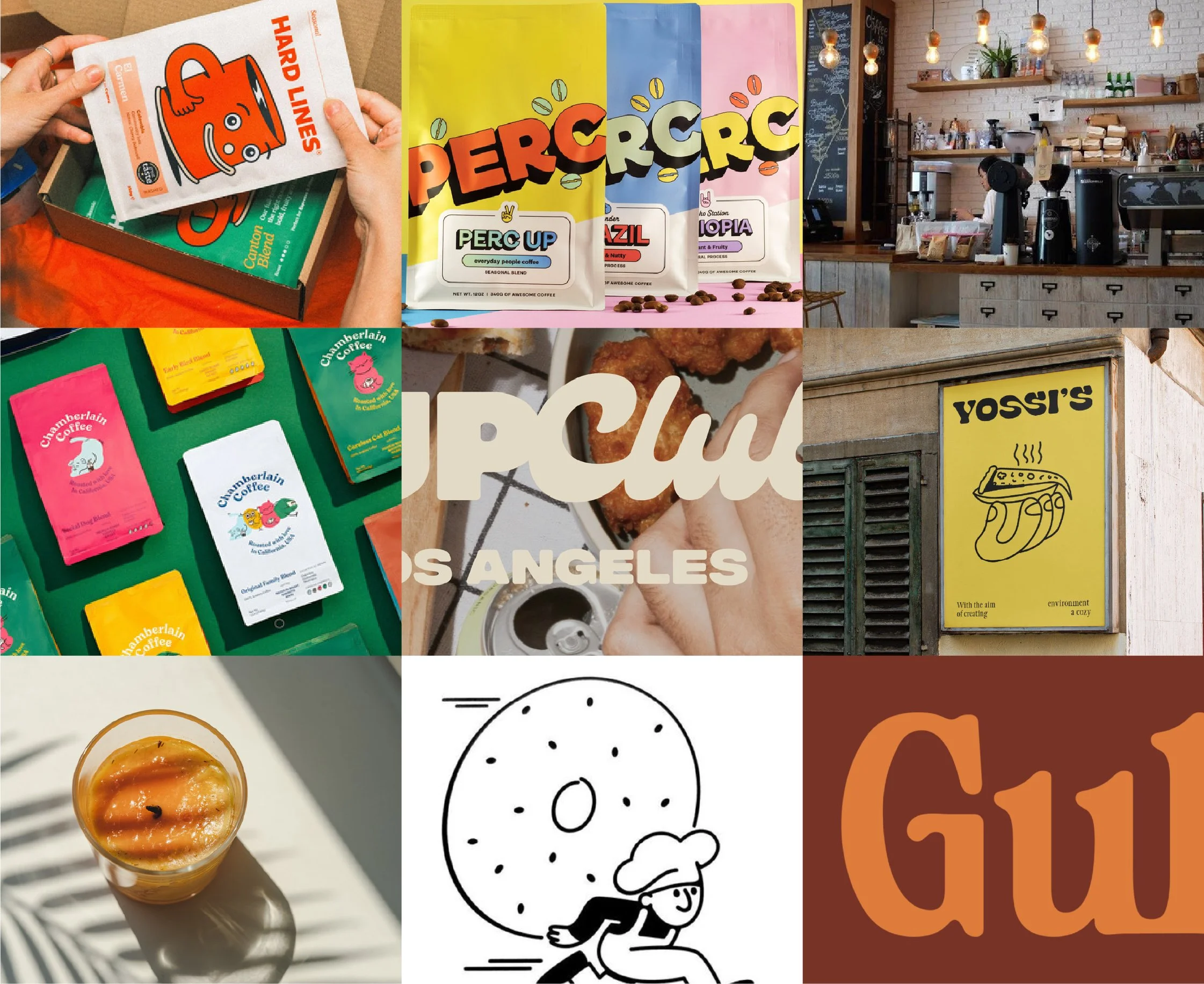


The Solution: A Cohesive Premium Identity
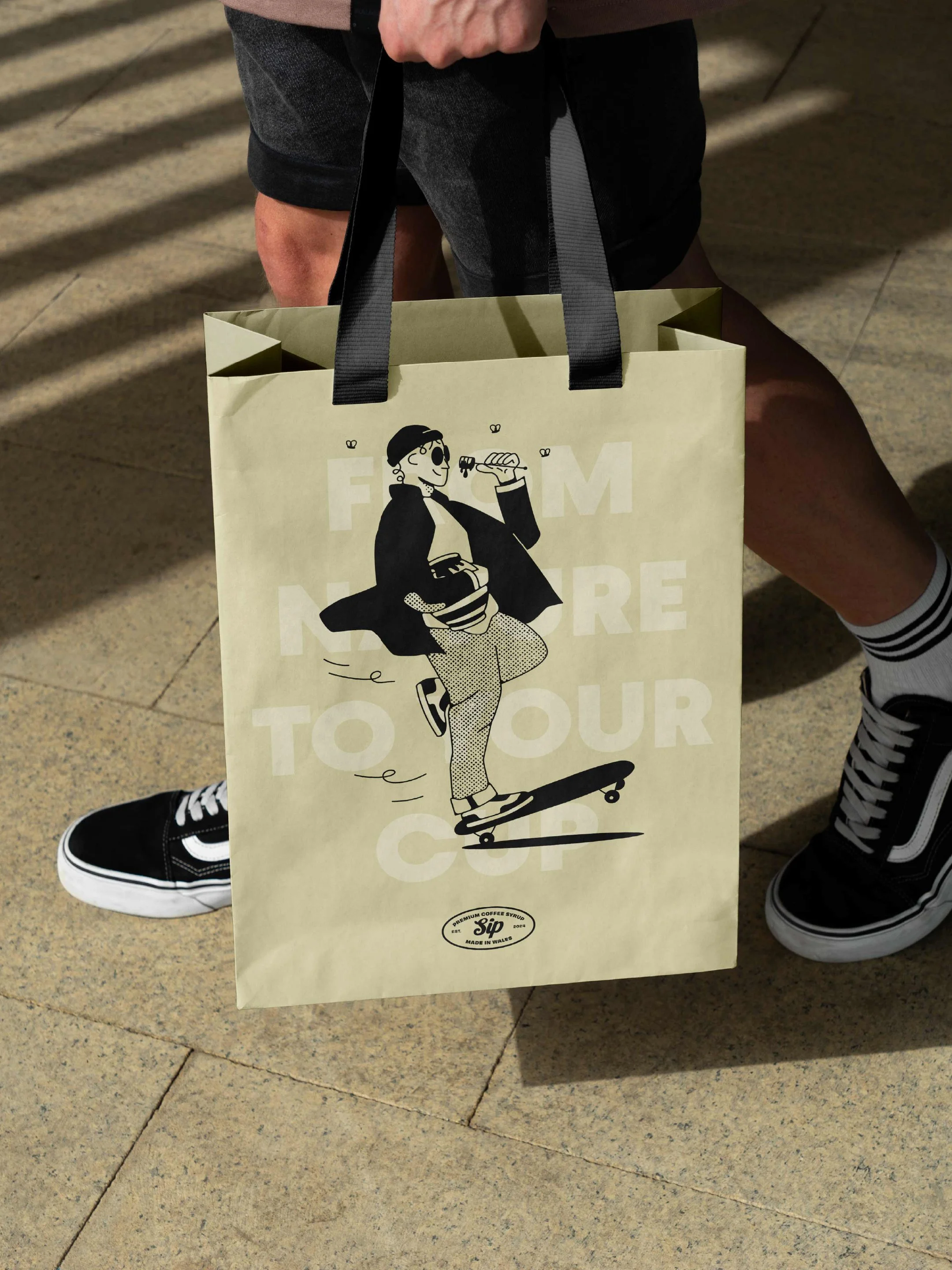
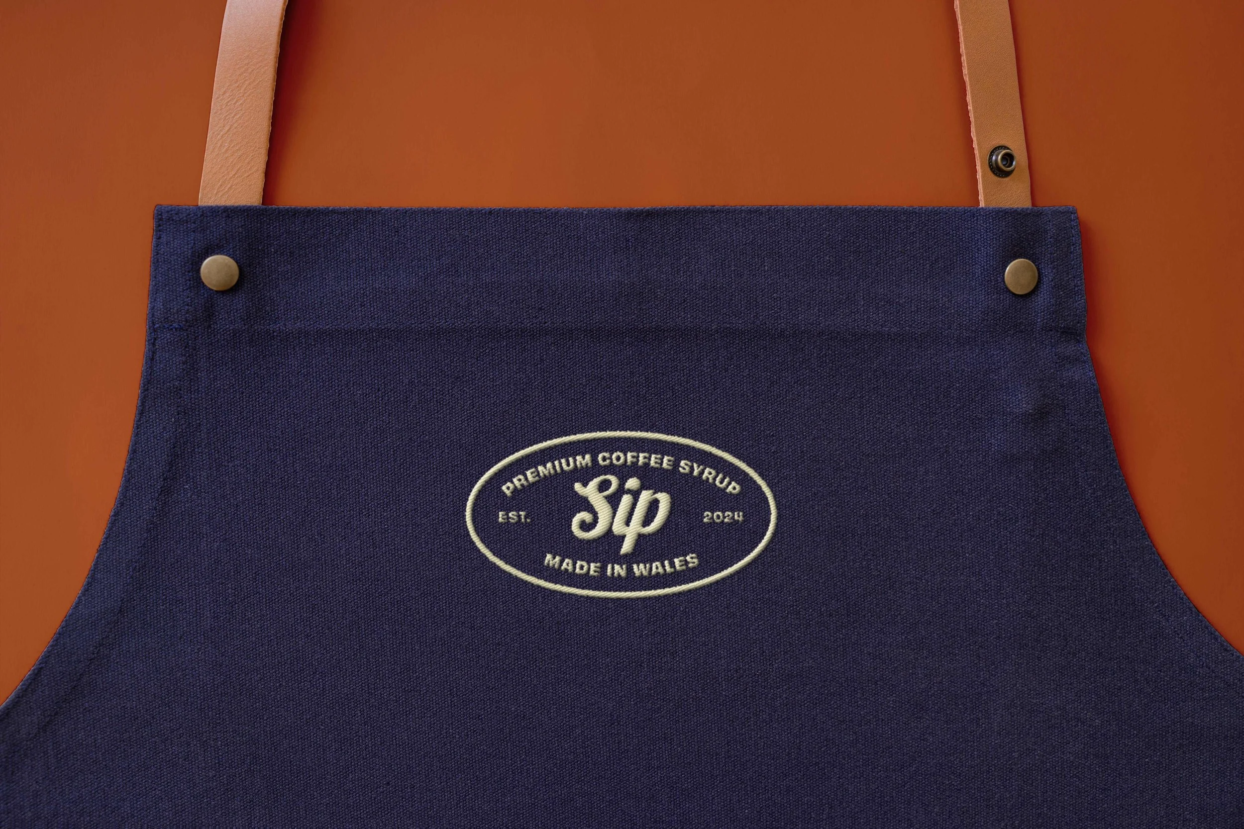
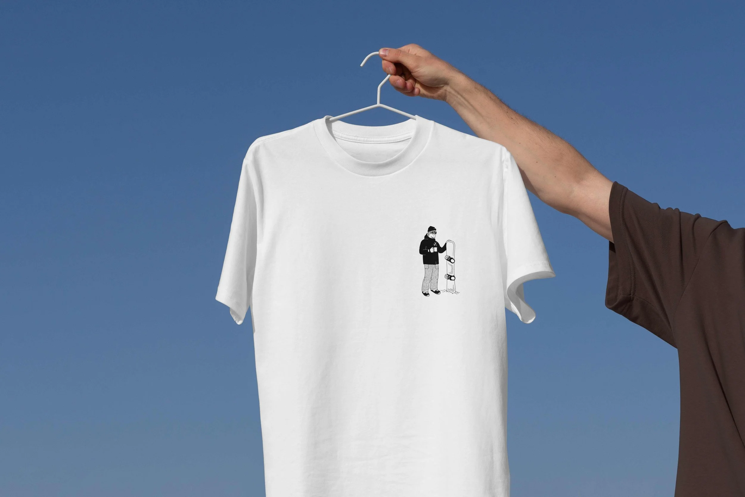
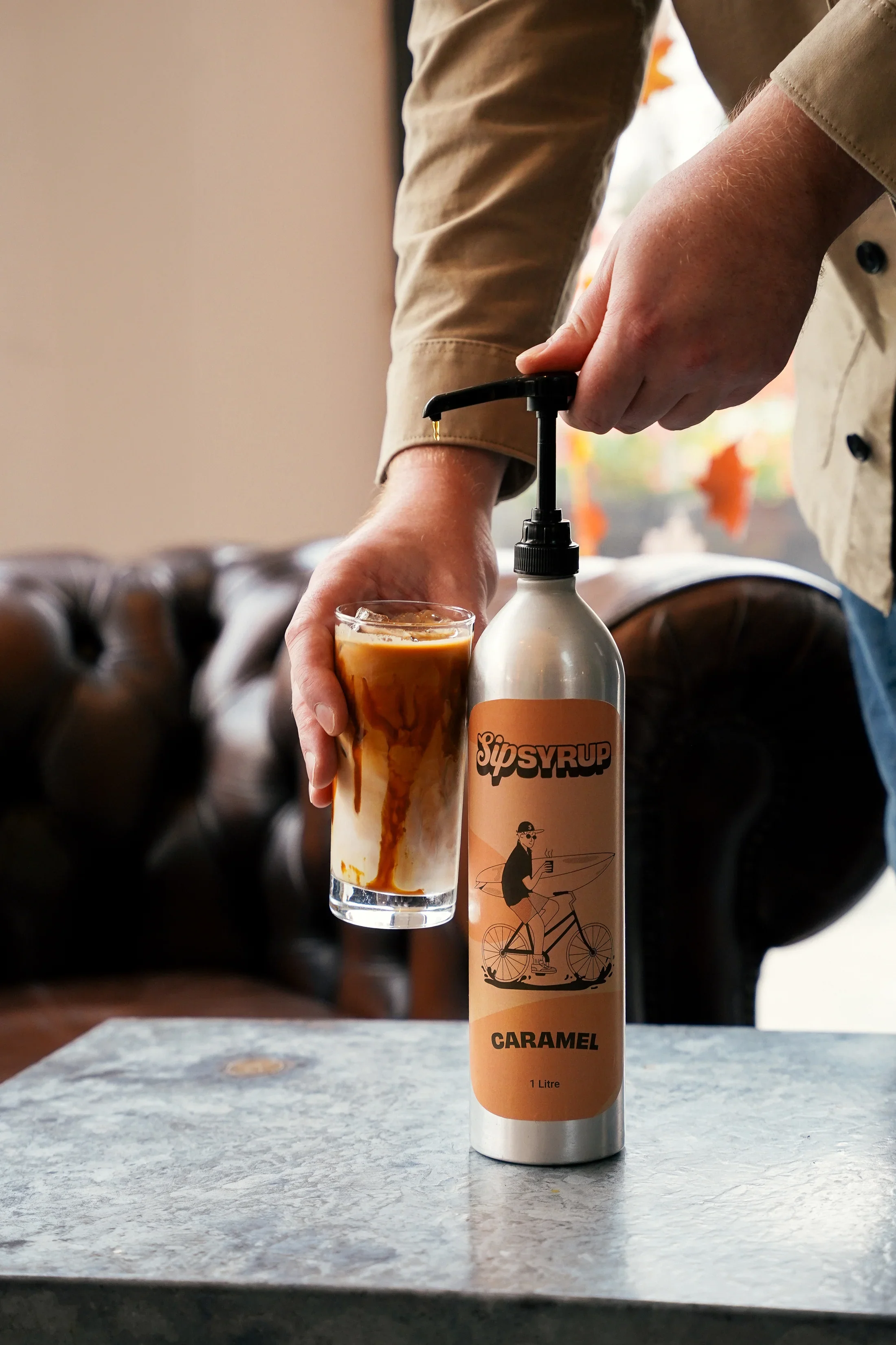
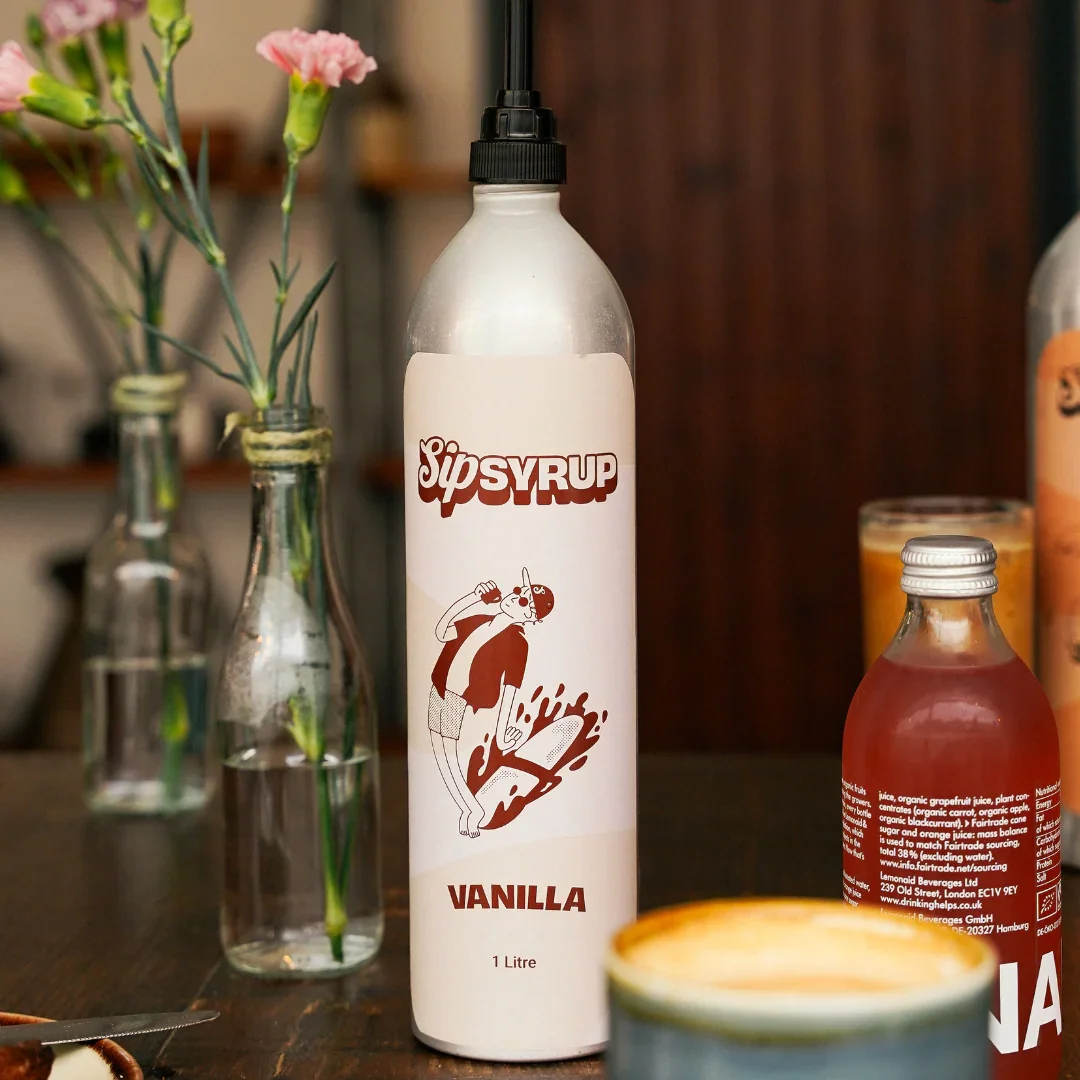
Our final design solution combined bold modern typography, vibrant colour accents, and playful, hand-drawn illustrations. The result is a brand identity that feels premium yet approachable.Highlights:Logo & Typography: Clean, modern, and flexible, designed for both packaging and digital presence.Colour Palette: Warm, vibrant tones that stand out on the shelf and signal artisanal quality.Custom Illustrations: Evoke the playful, sustainable character of the brand while maintaining premium positioning.Packaging Hierarchy: Designed for readability and shelf impact, guiding consumers to key product benefits.


A Scalable Illustration System Built for Growth
With multiple syrup flavours planned and more in development, the visual identity needed to evolve seamlessly as the range expands.Rather than creating one-off illustrations, I developed a flexible illustration system that grows with the brand while maintaining strong visual consistency.The illustration style is built on a consistent framework. Bold, simplified forms, confident line work, and balanced composition. This ensures:Immediate brand recognitionClear differentiation between flavoursCohesion across the full product range
Each new flavour can be introduced using the same visual language, allowing the brand to expand without losing clarity or impact.


Testimonial