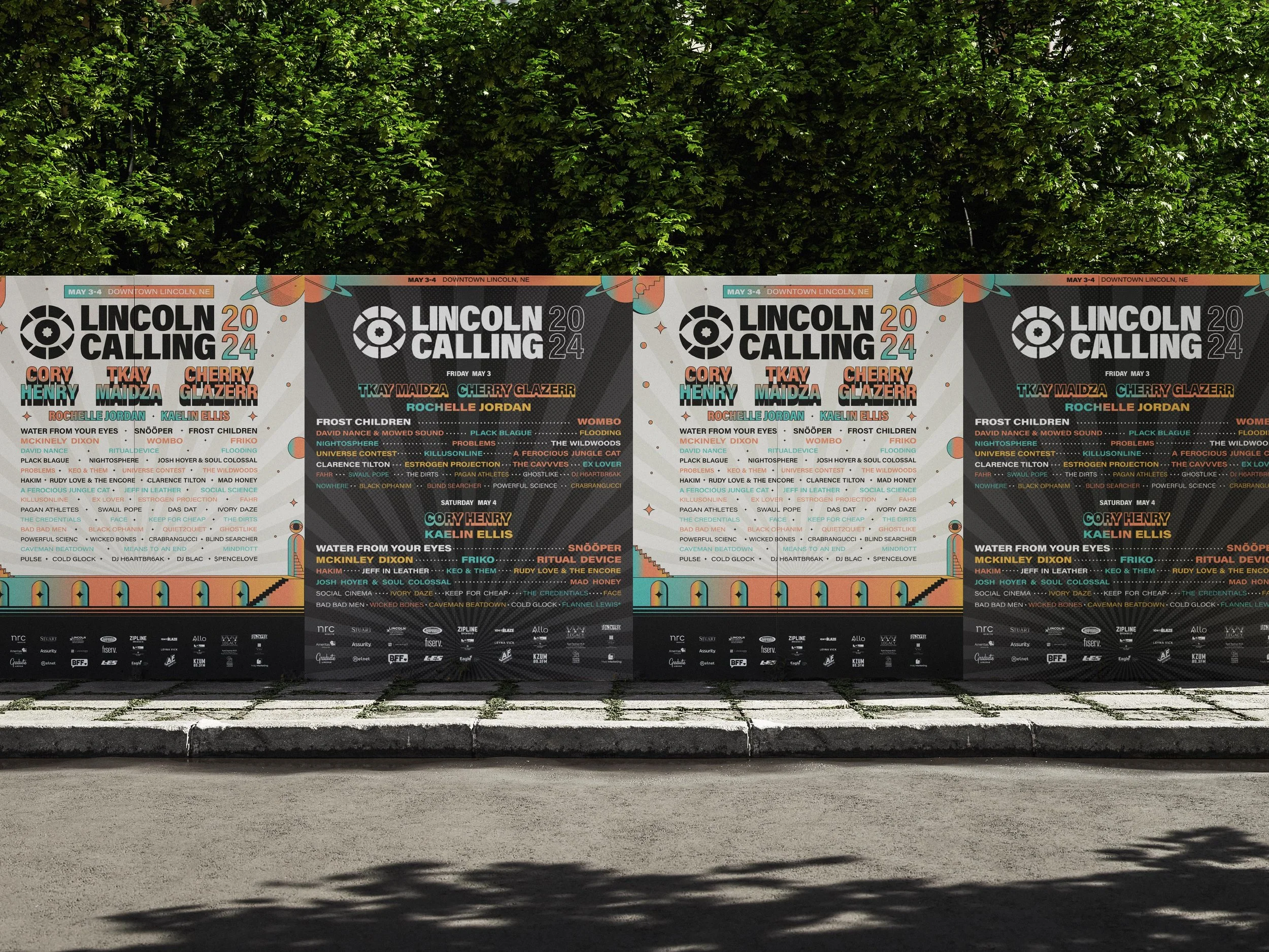
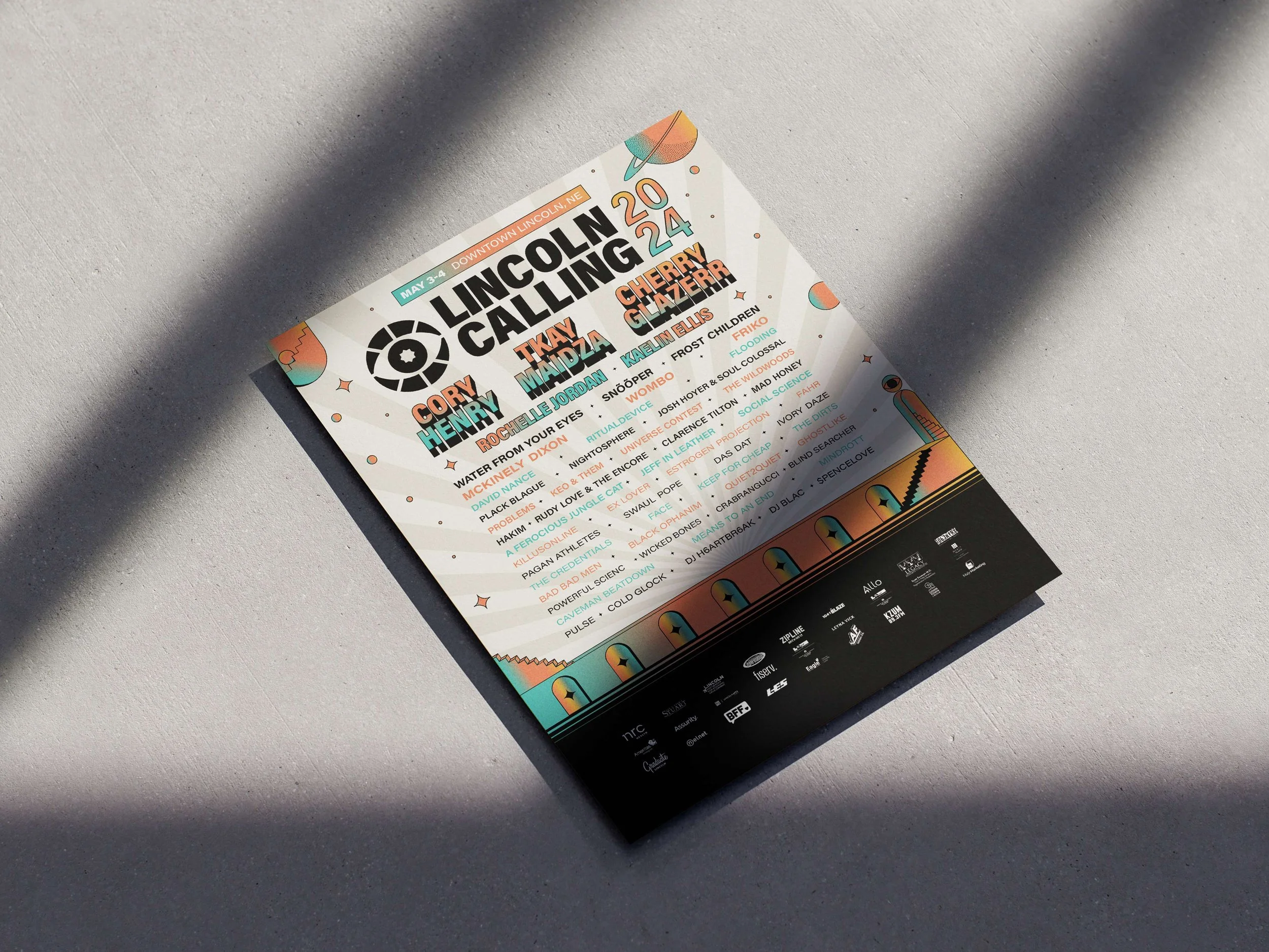
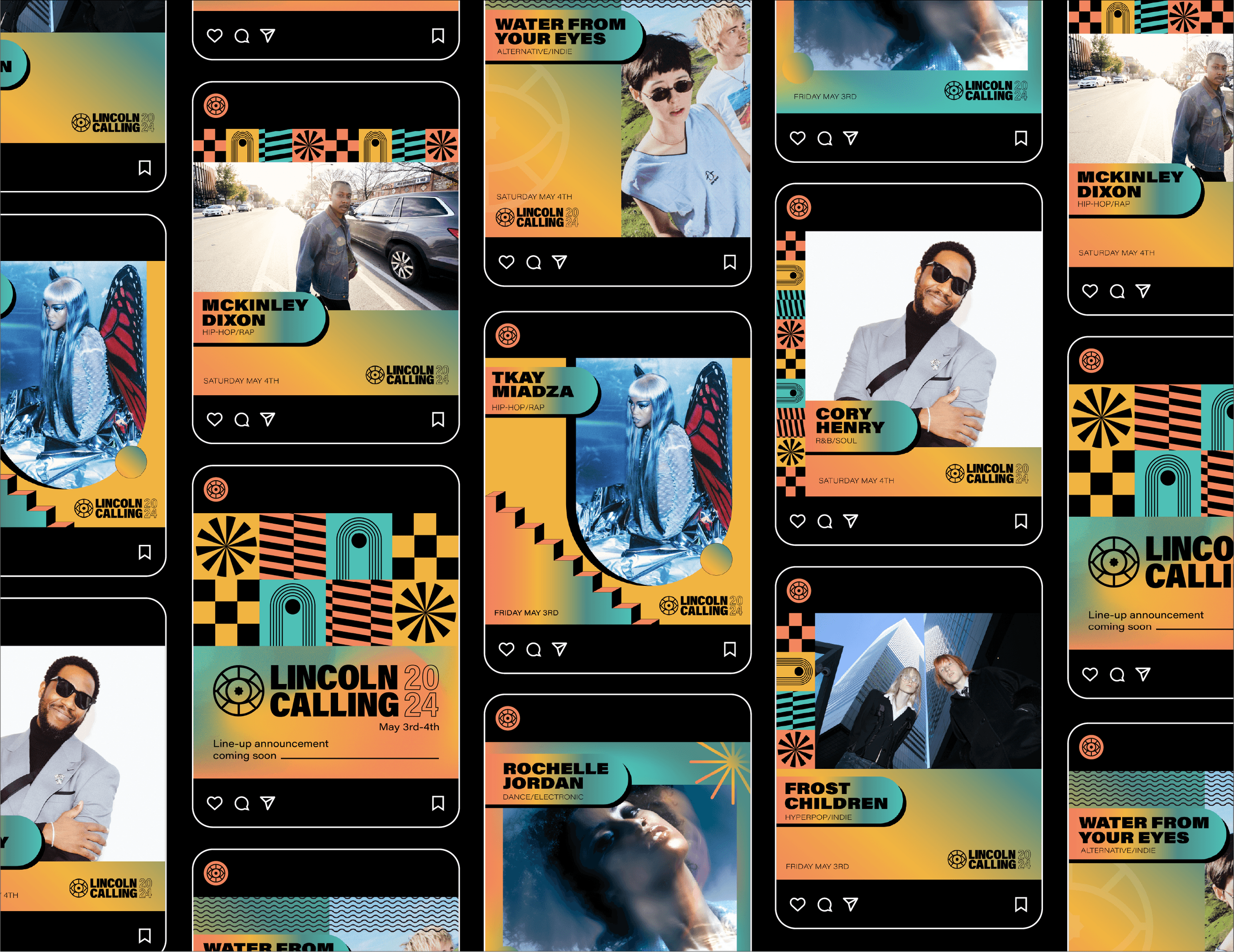
Lincoln Calling
Since its inception, Lincoln Calling has been dedicated to championing music, presenting a diverse and eclectic lineup of national, regional, and local performing artists. With a discerning eye for emerging talent nationwide, our annual roster highlights noteworthy artists on the rise.
The festival continues to expand, emphasising the development of a flourishing arts ecosystem, the promotion of arts education initiatives, and the empowerment of future creative leaders.
Lincoln Calling remains steadfast in its commitment to diversity, equity, inclusion and belonging, inviting all to join us in our ongoing quest to cultivate a more vibrant and culturally enriched Lincoln.
Client
Lincoln Calling
Field
Brand Design
Year
2024


The Brief…
In 2024, Lincoln Calling is celebrating its 20th anniversary. To commemorate this significant milestone, Lincoln Calling aims to rebrand to attract new fans to the already well-established music festival. During our initial call, it was emphasised that the festival is all about music "discovery." Their national artists are often emerging talents, recently signed, and might only be recognised by dedicated music enthusiasts across various genres. Therefore, I wanted to emphasise the sense of exploration inherent in the rebrand.

The logo mark
The logo design combines two primary inspirations: the bold, geometric shapes of the Lincoln, Nebraska flag and the symbolic image of an eye. The flag’s clean lines and circular layout give the logo a strong connection to the city, while the eye adds a sense of curiosity, exploration, and the excitement of finding something new. Combined, they create a mark that captures the festival’s mission, introducing people to fresh talent and inspiring moments of creative discovery.