

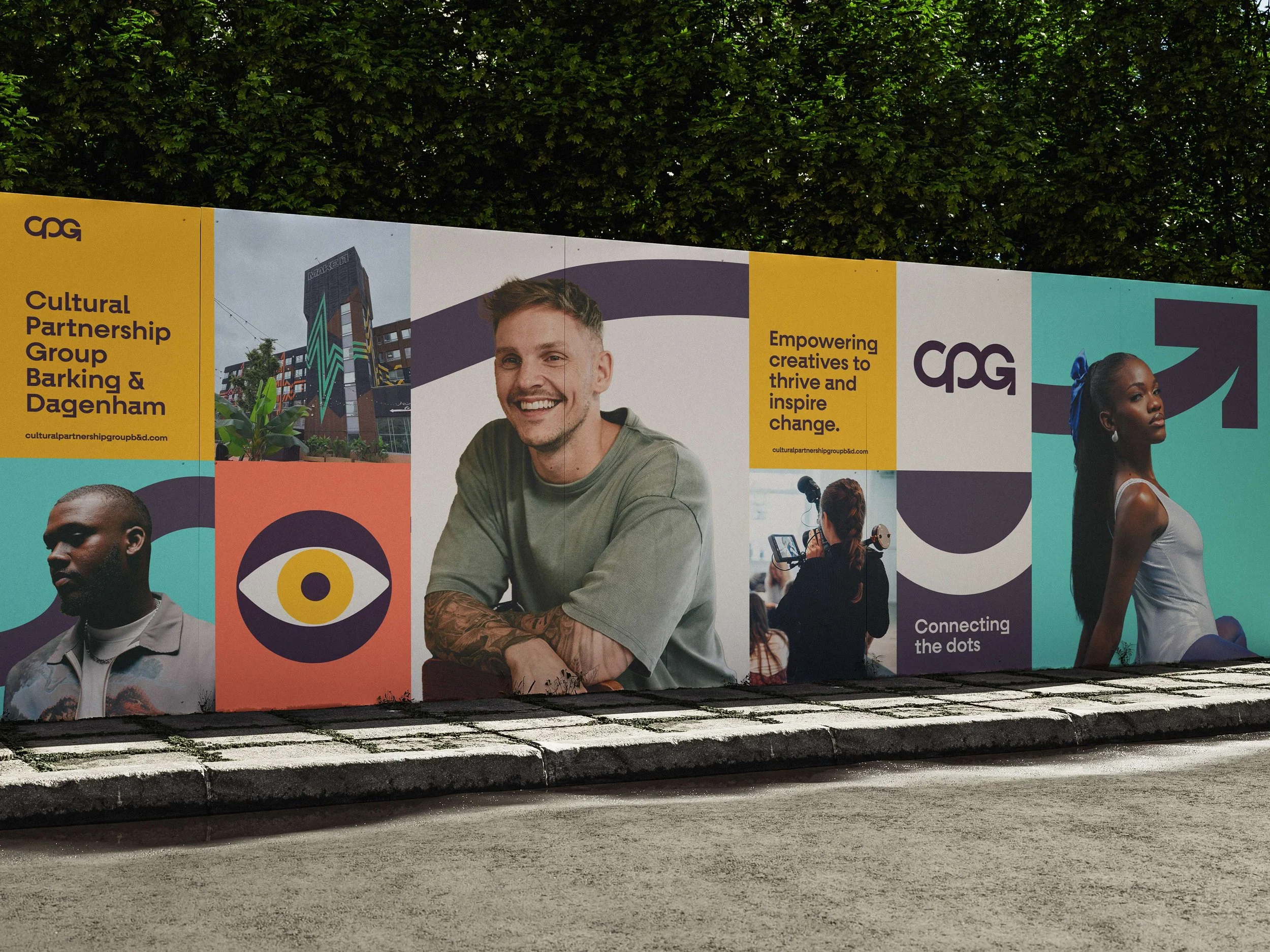
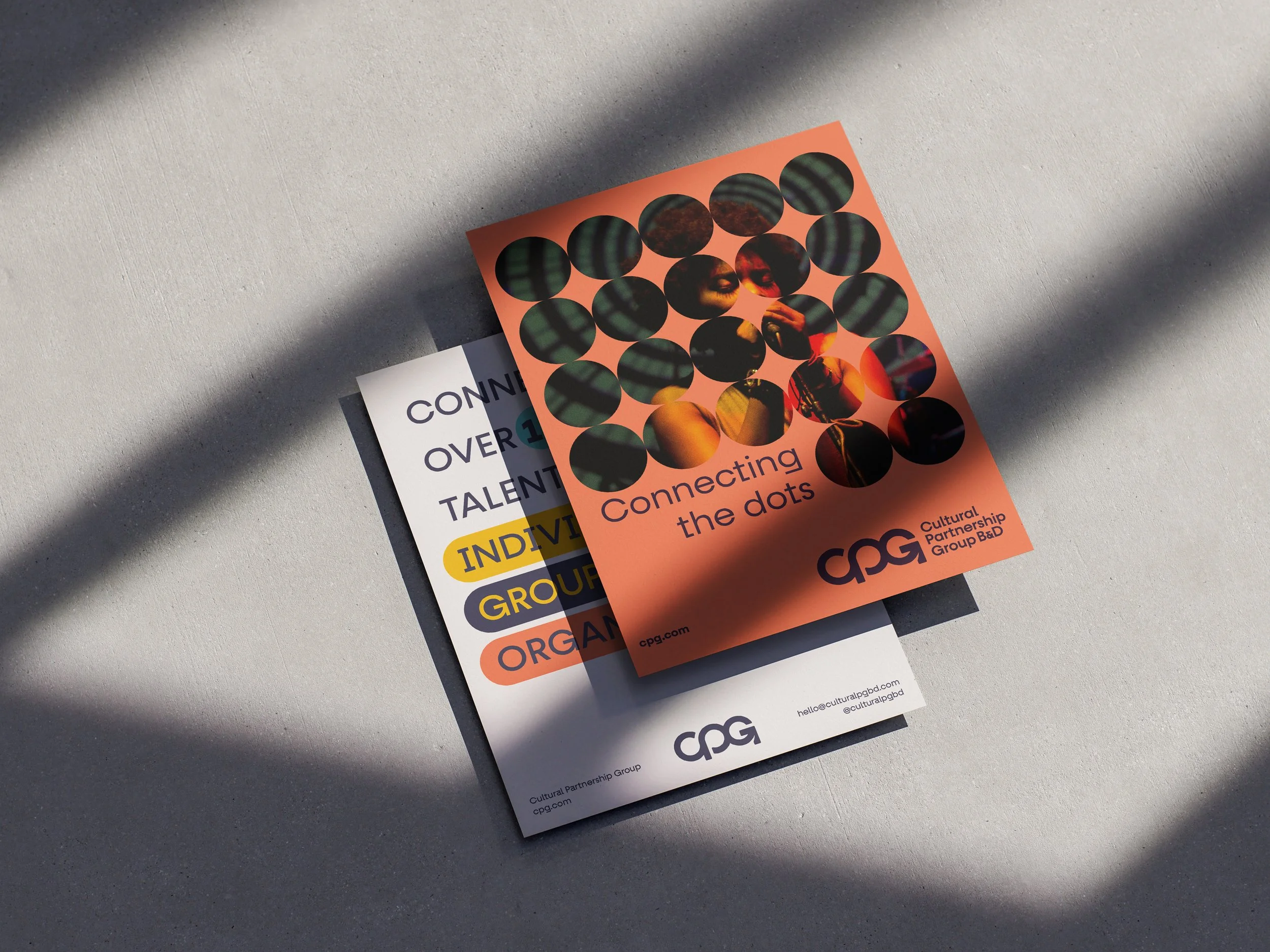
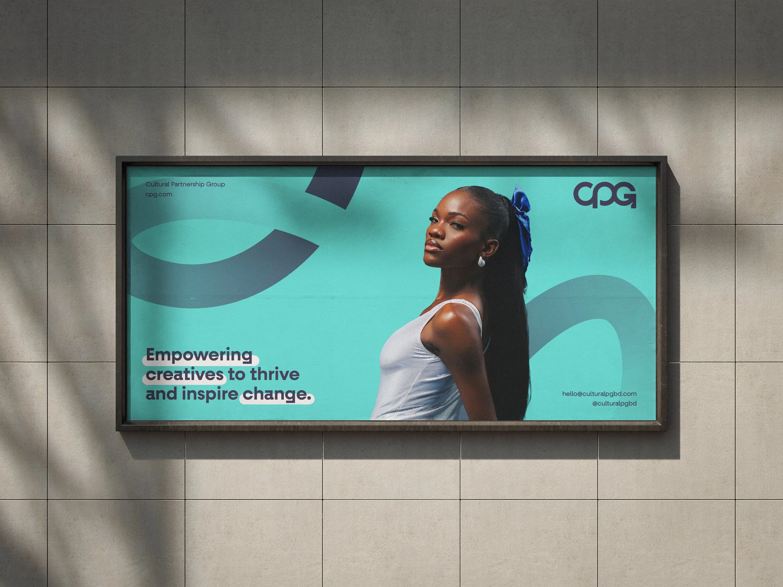
Cultural Partnership Group B&D
When I was approached by the Cultural Partnership Group (CPG), they needed support in developing a new logo and visual identity, something that would reflect their mission to bring together Barking & Dagenham’s creative community.
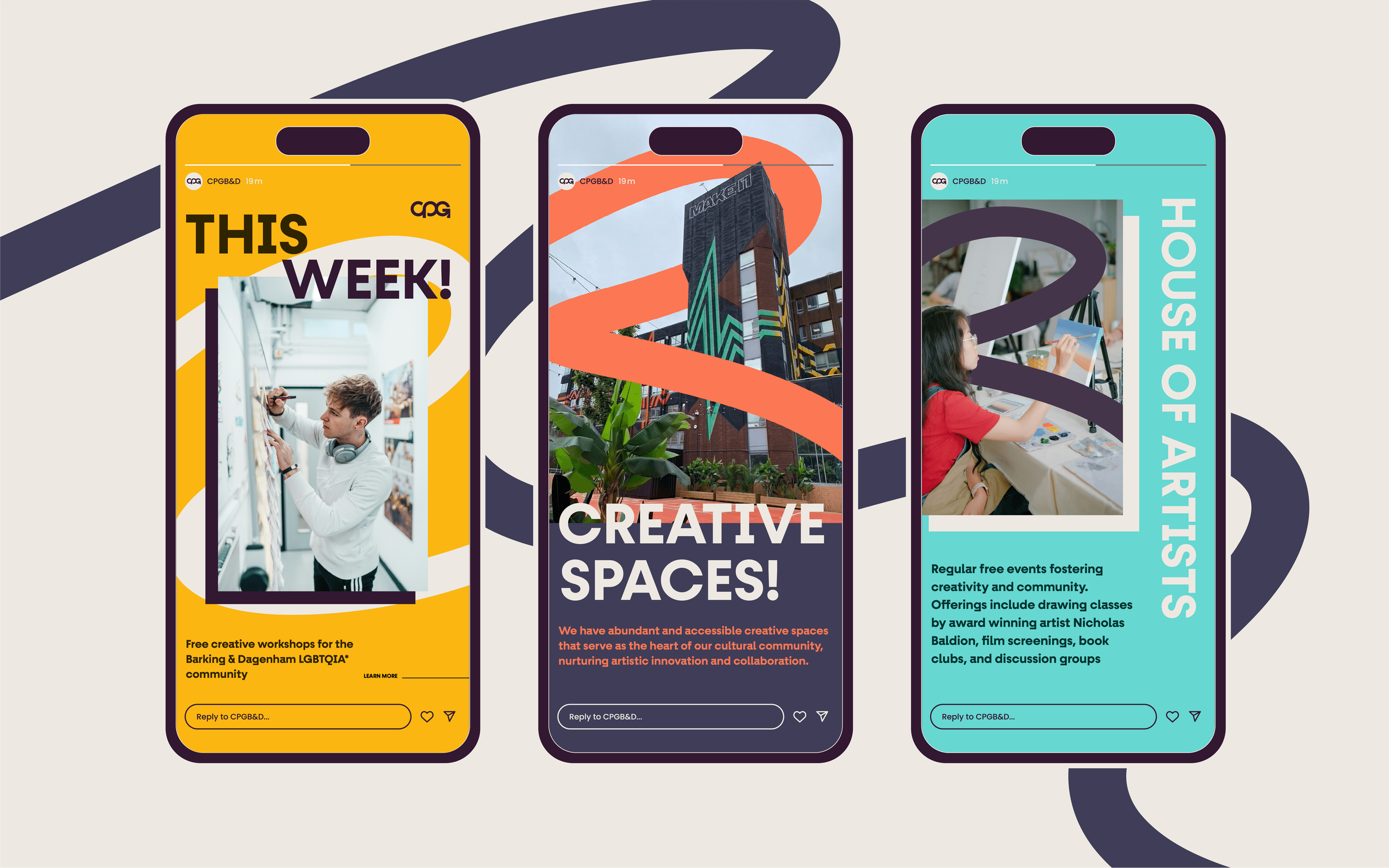
CPG is a creative network, empowering over 150 artists and organisations to collaborate and grow a vibrant, inclusive cultural scene through shared resources, training, and mutual support.
What made this project particularly meaningful for me is that Barking & Dagenham is where I was born and raised. Having the opportunity to contribute to something that champions creativity in the borough where I grew up was genuinely special.
Client
CPG
Field
Brand Design
Year
2025
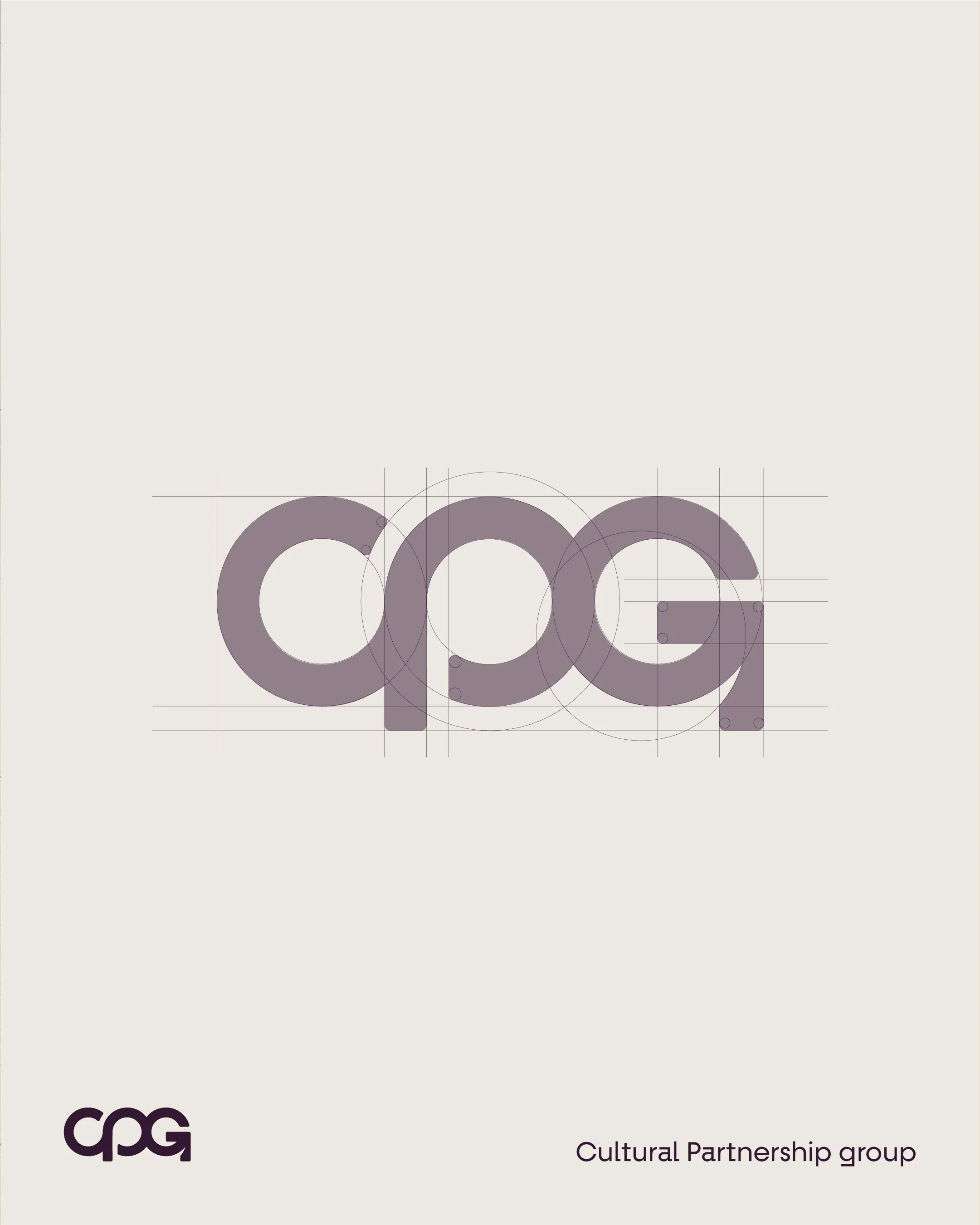
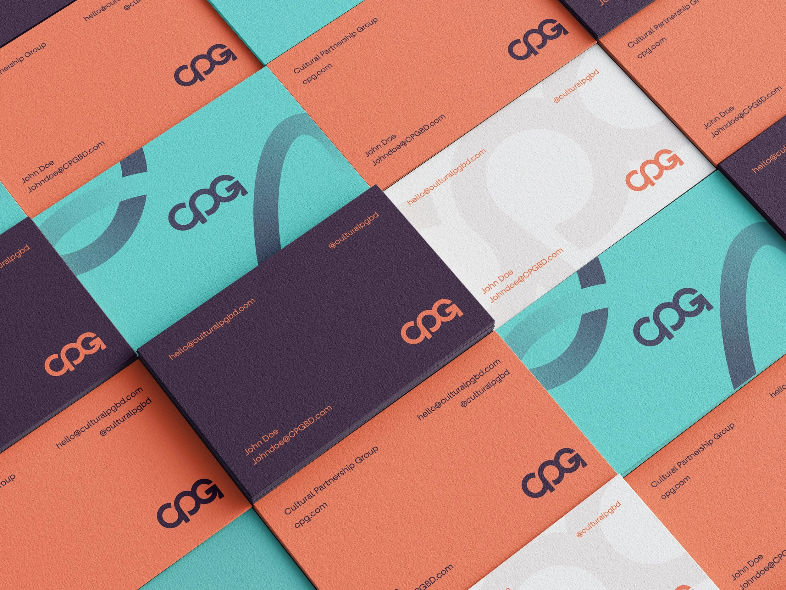
More than a logo…
Atmospheric, warped, mind-bending - these themes inspired the visual direction for the Brain Fog beer label. My process began with research and rough sketches to explore different ideas until I landed on a concept that best captured the essence Brain Fog wanted to convey.
After that, I refined the main illustration and created supporting background assets, enhancing the overall visual impact. The final step was experimenting with different colour themes. The craft beer sector is quite crowded, so the can needed to be eye-catching to stand out when placed next to its competitors.
Testimonial